About Us
What we're about
The beginning of American Image really happened at the 1964 World’s Fair when I met Robert Indiana, Andy Warhol and Philip Johnson at the New York State Pavilion with my grandmother. I was hooked on Pop Art right there and it is less than a coincidence that I ended up working with those three geniuses on numerous projects.
Later, in college, I started a magazine of Art & Poetry rendered in calligraphy. It attracted a Who’s Who of American poets, including Harvey Shapiro who was then the editor-in-chief of The NY Times Magazine and the NY Times Book Review, as well as head of The Columbia Journalism School, a scholar, a judge for The Pulitzer and a great poet. Most importantly though, Harvey was very humble, a fantastic teacher and in many ways mentored my work as an artist, author and publisher, all of which he, obviously, understood quite well. Inspiring genius. The magazine attracted several Pulitzer Prize Winners – Mark Strand, John Ashbery, Anthony Hecht, Robert Creeley – some high profile writers, mainly through Harvey, Edward Albee, Tennessee Williams, Mario Puzo, Norman Mailer as well as John Hollander, the voice of Shape Poetry. It also attracted the man Hollander deemed “The greatest shape poet ever. Who else could make a poem and a work of art from a single word but Robert Indiana.”

The Early Years
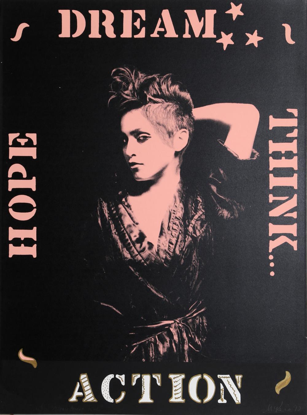
The early version of American Image was Renaissance Press which focused on the magazine and my early portraits, created in small editions of silver print, sepia tone and duotone photographs often hand colored or hand oil painted 16” x 20”. At some point I apparently lost my mind and started printing 4’ x 6’ which surrounds you with enough toxic chemicals to knock you out, and which happened thus abandoning those works in favor of living. Circa 1977, I did a series of portraits of Andy Warhol who questioned my oil on photograph with “Isn’t that messy and slow?” at which point I studied Andy’s process: silkscreening. The layering of a photographic portrait in a whirl of paint and colors combined all the things I loved: photography, drawing, painting and experimenting. I was hooked and set up silkscreen stations in my photo studio, printing on everything from paper to canvas to glass to rugs. For a brief time I wrote a series of best selling biographies, the first on Saturday Night Live!, the first book on that great show, then on Billy Joel, the first book on that great showman, then on Madonna, the first book on that great artist. We still do books but mainly on artists we are publishing or on major projects we are working on.

After publishing numerous of my own silkscreens, other artists began asking me to publish their work.
First was Ronnie Cutrone, who was Warhol’s right hand man and with publishing behind went from artist assistant to star in two years. We were then approached by Larry Rivers, an artist I grew up loving as the consummate painter/experimenter Artist with a capital A. We did many projects with Larry and set up his first museum show in NY at the Nassau County Museum. Larry, who loved to experiment, worked with me developing large scale, highly complicated, multi color silkscreens on paper and canvas which had the power and feel of painting, which became one of our trademarks. I was also curating shows at a racehorse rate all over NYC, LA, Miami and Chicago. I was named American Curator for the Museum of Modern Art in both San Paulo and Rio de Janeiro creating a series of travelling exhibitions that went throughout Brazil with works by Warhol, Indiana, Sultan, Katz, Oldenburg, Wesselmann, Bell, Borofsky and Stella, all of whom we published. The breakthrough piece, ironically, was by Indiana, then a sleeper, who at my insistence did AMOR which Brazil took as a Love Letter from Pop ART to Brazil and it was a beautiful gift from an artist to a country.
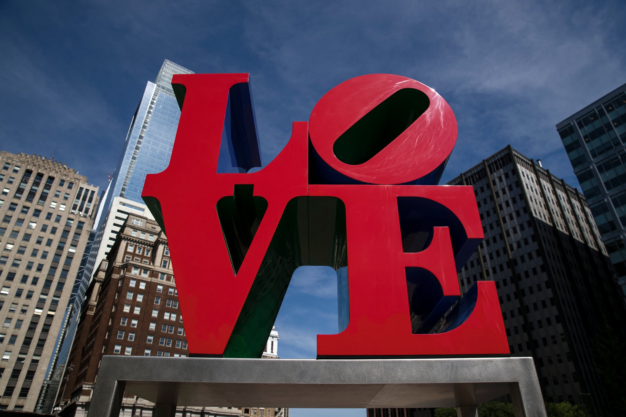
In 1993 I decided to follow up AMOR with a monumental portfolio of Indiana’s LOVE, something that may seem obvious now but which was ultra creative and high risk then.
The portfolio combined the two things American Image was bred from, Art and Poetry, and even Indiana at the time thought it just wouldn’t work, that Love was a 60s thing no longer prominent. I think it’s one of those things you do when you have a longtime hero down a quart, you take your talent to revive his. I worked for two years on the portfolio going through a huge amount of trial proofs before we had it, I felt, so perfect it could not possibly fail. I created a massive showcase for the portfolio which got both the NY Times and The Today Show, then got my friend Jay Chiat to greenlight LOVE for Absolut Vodka, then the most visible vehicle the art world had. Indiana was back and so was LOVE. It also helped brand American Image as the portfolio continuously soared in value, beginning at $2500 and it’s most recent high water mark just under $200,000.

I went back to silkscreening on cans in a painterly way, the thing that brought me into silkscreening to begin with and did a series of amazing projects with three very great artists: Alex Katz, Donald Sultan and Robert Cottingham. The Cottingham project was both a monumental portfolio and a series of 79” x 79” canvasses which became the exhibition for The 50th Anniversary of The Boca Museum. The Katz and Sultan were also monumental works installed permanently in the lobbies of buildings produced by Roy Stillman, an artist of real estate development, and designed by I.M. Pei and Philip Johnson, The Crown Prince and King of American Architecture.
I was about to embark on a projects with John Chamberlain and James Rosenquist when I got the urge to launch another project with Robert Indiana. I was sad to have Bob tell me things were not going well as I thought the send off I gave LOVE would have made him rich. I told him he should make another international icon like LOVE and he said he did but it didn’t work – it was FUCK with a tilted U. Simply stated: NO. After several days we determined that the follow up icon had to be: 1. A four letter word; 2. Stacked two letters on top of each other and 3. Ideally a tilted O as the top right hand letter. We toyed with HOME..FOOD…GOOD….and I left thinking.
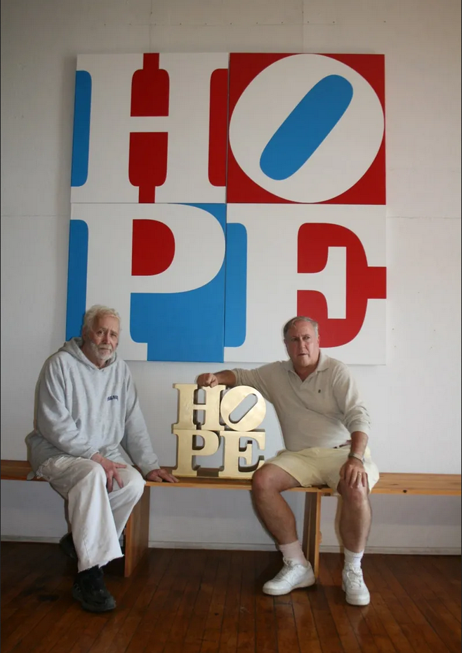
Driving up Third Avenue in Manhattan I noticed a poster in a phone booth [they still had them in 2007] of The Dalai Lama, who I had photographed at my country house, and under him in bold letters it read HOPE. Immediately hit me that if the 60s were the LOVE Generation surely the new millennium was the HOPE Generation. I drove to my studio drew HOPE with a tilted O on paper then began rendering it in various colors, then commissioned a 3D version. I brought it up to Indiana in Maine with a full scale display and a plan for getting Bob an icon for the 21st Century that world match his icon for the 20th Century. It was exciting – although creating a work from scratch to make it a famous icon not the easiest task. Again, I got the Today Show and most importantly got Barack Obama to use it for his campaign, some Bob wanted to do as he was impressed with Barack’s book, Audacity of Hope, as was I. HOPE was born in a series of paintings based on my drawings, a monumental Stainless Steel Sculpture unveiled at The Democratic National Convention and an edition of 200 prints for the Obama campaign which ultimately sold for $25,000 at peak, a record price for an Indiana print.

Indiana had grand Hopes for a museum, although like following up his LOVE with FUCK, the plan and strategy was weak. For one, almost all his most important works had been sold so what would be in his museum? As I had shown him both with his own work and that of Katz and Rivers, contemporaries he respected, I had the capability of making amazing silkscreen paintings and these could replace the many important paintings that were forever gone from his museum dreams. I decided I would forego numerous projects with other artists – although I still did a few – to work almost exclusively with Bob on editions, sculpture and paintings. We set a goal to not only remake his masterworks for his museum but to be the most prolific artist/publisher team in the history of art. I think we hit it.
Our staff is tight, smart, talented art school refugees and we feel privileged to make works of historical importance as our career. I’ve learned that if you work with geniuses things tend to work out.
- Michael McKenzie, 2019.
